Took a POS web app to mobile & made 50% faster workflow
Took a POS web app to mobile & made 50% faster workflow
Took a POS web app to mobile & made 50% faster workflow
Product
Postree
Postree
Industry
Hospitality & Payments
Hospitality & Payments
Timeline
4 Weeks
4 Weeks
Tools
Figma
Figma

Context
Context
Postree is a POS (Point-of-Sale) product for managing orders & payments of restaurants in Ireland I was assigned to convert the existing web POS product into a handheld POS app with better UX and minimal changes to the core user flow
Postree is a POS (Point-of-Sale) product for managing orders & payments of restaurants in Ireland I was assigned to convert the existing web POS product into a handheld POS app with better UX and minimal changes to the core user flow
Decoding the Workflow
Decoding the Workflow
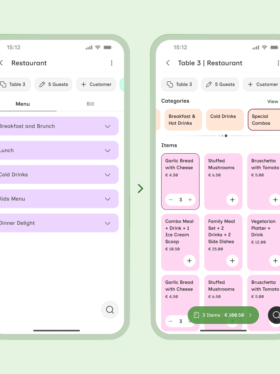
The existing POS was built for a 15-inch touchscreen, with dense workflows of 20+ actions happening across a screen While understanding the product & competitors, I noticed the sales & ordering flow was the most frequently used part of the experience
The existing POS was built for a 15-inch touchscreen, with dense workflows of 20+ actions happening across a screen While understanding the product & competitors, I noticed the sales & ordering flow was the most frequently used part of the experience


Designing for Scale
Designing for Scale
As the flows expanded, for maintaining consistency, I built reusable 370 variables & design tokens to make future iterations faster
As the flows expanded, for maintaining consistency, I built reusable 370 variables & design tokens to make future iterations faster


Reducing Navigation
Reducing Navigation
Restaurant staff constantly switch between categories & item customizations while taking orders Hence, I iterated 3-4 times on order flow, which combined horizontal navigation, vertical browsing, and bottom-sheet customization to reduce order-taking effort by nearly 50%
Restaurant staff constantly switch between categories & item customizations while taking orders Hence, I iterated 3-4 times on order flow, which combined horizontal navigation, vertical browsing, and bottom-sheet customization to reduce order-taking effort by nearly 50%

Improving Everyday Actions
Improving Everyday Actions
1. Thumb-friendly actions - Important actions were placed within the thumbzone to reduce finger stretching during busy workflows 2. Faster menu browsing - Combined horizontal category navigation with vertical item browsing so staff could move faster through large menus 3. Familiar item customization - Customization flow were designed closer to food-ordering apps to make interactions feel instantly familiar 4. Faster cash handling - Added quick amount chips for cash & tips so staff could collect payments faster without relying on the keyboard
1. Thumb-friendly actions - Important actions were placed within the thumbzone to reduce finger stretching during busy workflows 2. Faster menu browsing - Combined horizontal category navigation with vertical item browsing so staff could move faster through large menus 3. Familiar item customization - Customization flow were designed closer to food-ordering apps to make interactions feel instantly familiar 4. Faster cash handling - Added quick amount chips for cash & tips so staff could collect payments faster without relying on the keyboard


Bringing It Together
Bringing It Together
The final experience focused on speed, accessibility, & reducing friction across ordering, billing, & payment workflows After 30+ iterations, the project was delivered with 120+ screens supported by variables
The final experience focused on speed, accessibility, & reducing friction across ordering, billing, & payment workflows After 30+ iterations, the project was delivered with 120+ screens supported by variables


Impact & Learning
Impact & Learning
Order-taking was 50% faster compared to web flow. The item customization & invoice flows became single-screen interactions on mobile The constraint of a smaller screen forced me to make better decisions than the web version ever had
Order-taking was 50% faster compared to web flow. The item customization & invoice flows became single-screen interactions on mobile The constraint of a smaller screen forced me to make better decisions than the web version ever had